Sunday, October 25, 2015

Field Activity #5: Development of a Field Navigation Map and Learning distance/bearing Navigation

Introduction
Many techniques have been developed by humans for navigation purposes. These techniques vary in complexity, ranging from requiring simple tools to advanced technology. For example, humans have used the stars, moon, and sun to navigate for hundreds of years. Now, most individuals rely on GPS technology to navigate to their point of interest, however in our previous lab, we discussed the unreliability of technology. Due to this, this weeks lab is designed to teach us how to navigate using a pace count, which does not require the use of advanced technology. During this activity we constructed two navigation maps that will be used during our next weeks exercise at The Priory, in Eau Claire, Wisconsin.

Methods
This week's lab consisted of two activities. For the first activity, our class went outside to determine our personal pace count for a 100 meter distance. I determined I walked 68 steps within the 100 meter distance. This information will be used in our next week's lab when we begin navigating at the Priory.

For the second activity, we were instructed to make two navigation; one with a 50 meter UTM grid, and another with geographic coordinates in decimal degrees. Aside from these requirements, we were encouraged to design the maps how we personally deemed best fit for pace count navigation purposes.

To design these maps, I began by making the UTM grid map. I beganby adding the background aerial imagery of the city of Eau Claire created by my professor Dr. Joseph Hupy. I then located the Priory in the image and fit this to the data frame. From here, I changed the coordinate system to NAD_1983_UTM_Zone_15N and then navigated to the properties of the data frame to add a UTM Grid measured at 50 meters. A grid is added to the data frame by entering the data frame properties window, followed by selecting the Grid tab (Figure 1). From here, I select New Grid. A Grid Wizard window appears, and walks you through the parameters of setting up the grid. I selected the Measured Grid grid type, which will divide your map into a grid of map units. Most default parameters were selected within this Wizard window, however I changed the Interval setting to 50 for both the X and Y axis. Because this map was given a UTM projection, the map units are in meters. Therefore, setting an interval of 50 created a grid with grid squares measure 50 meters for both their X and Y lengths.

I repeated this process to create the Geographic Coordinate System map, however I made a few adjustments. This time I added the same aerial imagery of the Priority however set the coordinate system to GCS_WGS_1984. From here, I entered the data frame properties and made another measured grid for this map. Because, this map is in an unprotected coordinate system, the grid is measured in decimal degree intervals of about 0.0006.

Figure 1: Displays the Grid tab of the Data Frame Properties window. The highlighted option button, "New Grid", is where to begin creating a grid for the data frame.


Along with the grid, I added contour lines to the map and labeled their elevation on both maps. Additionally, I included the final map requirements of a scale bar (in meters), a representative fraction ratio (in meters), compass, legend, title, and data source. The final products of these maps can be viewed in figures 2 and 3.


Figure 2: Aerial image of the Priory with a UTM 50 Meter grid overlaid.
Figure 3: Aerial image of the Priory with a geographic coordinate system grid measured in decimals degrees overlaid.

Discussion
While designing my maps, it was important to keep in mind what my maps will ultimately be used for. For our next week's navigation project, we will be divided into groups of three and given a designated path that is maps out by various navigation points. One team member will stand at a marked point, and another will start at this location and will keep their pace count until they reach the next marked point. Because this will be the first time myself and my teammates have walked this path, it is important to design a map that will inform us of the terrain is like within our path ahead. However, we discussed in class that often times it is a common misconception to add a lot of data to maps used for large scale field work. After learning this, I decided to keep my maps simple yet informative by adding only grid measurement and contour lines with elevation data. I added the contour lines in hopes that it will help inform the map reader of what the terrain elevation is like in places they are unable to physically see.

Furthermore, it is evident that the difference in coordinate system would effect one's ability to navigate. Knowing be measured our pace out in paces/meters, it seems to me it would be very difficult to convert this into paces/decimal degree. My assumption is that the UTM coordinate system is the best option to use for our navigating map due to this fact it has a map unit of meters. During next week's activity, we will be combining the use of these grid navigation maps with the pace count and compass navigation technique. In my field activity #6 report I will document the methods and analysis how well our methods worked while navigating at the Priory. Additionally I will review which features are more helpful to include in the navigation map.

Conclusion
This weeks activity was designed to introduce our class to the navigation techniques that requires the use of grid maps and pace counts. This lab is a two week activity, that began this week with the creation of our grid maps. In order to create functional maps, I was required to understand how UTM and geographic coordinate system grids are used for navigating. This gave me practice in designing a map for a specific field methods use.
 

Friday, October 16, 2015

Field Activity #4: Unmanned Aerial System Mission Planning

Introduction
This week I was exposed to the functioning of Unmanned Aerial Systems (UAS), and was introduced to the different UAV platforms. In the lab, I observed several models of UAV's owned by the UWEC Geography Department. Later, our class went to the field to practice handling the UAC. While on campus, we captured aerial images using the DJI Phantom. After the imagery was collected, I was introduced to three different types of software that can be used for UAS applications. My experiences and results from the lab are detailed below.

Methods

Flight Demonstration

On October 5th, my class went to the floodplain of the Chippewa River, located on the campus of University of Wisconsin - Eau Claire (UWEC). Here, we flew the DJI Phantom along the shore to collect georeferenced aerial imagery. The Phantom is set up to take images rapidly enough that each image will be 70% overlapped with the consecutive image. These qualities will allow us to create a DEM overlaid by a 3D image generated in Pix4D.

Software

1) Pix4D
As described above, Pix4D processes images to create a DEM and 3D high resolution image of the terrain. To generate this image, I was required to select a group of images from a common location. After choosing about 100 images, I imported these into Pix4D. This took about two hours for the program to process the images. Although Pix4D generated several outputs, for my purposes only two images were required. First, I located the Mosaic tif file within the DSM_Ortho folder. Once this was brought into my map document, I adjusted the base height to float on the DSM tif, giving the image elevation values. I also added a shading effect that gave all features a shadow relative to the scene's light position.   
Figure 1a: View 1 of the Pix4D orthomosaic output laid over the DSM output.


Figure 1b: View 2 of the Pix4D orthomosaic output laid over the DSM output.

Figure 1c: View 3 of the Pix4D orthomosaic output laid over the DSM output.


2) Mission Planner
Within the Mission Planner program, you are able to plan out your own automated flight missions at any location of interest. This allows you to alter a variety of parameters such UAV type, camera sensor, and altitude to compare how these would affect the data quality and the flight. For example these parameters may alter the following variables: the number of images take, the resolution of the images, the flight time, and the flight path. Comparing how the statistics are altered will help when making educated decision about which parameters are best to use for your study area.

While using Mission Planner, I concluded a few basic assumptions for UAV photography listed below:

1) The higher the altitude, the fewer flight paths. This is related to the camera's Field of View, or in other words the distance a camera captures widthwise within an image. The Field of View increases as the distance from the image's subject increases.
2) The higher the altitude, the shorter the flight time and fewer images required.
3) The higher the altitude, the higher the image resolution (meaning lower image quality).
4) Changing the drone type did not alter the output's variables.
5) The camera does not always have a significant effect on the output's variables.

The following images show how the flight plan and image variables differ from low altitude and high altitude flights.

Figure 2: This images displays an automatic flight plan of a 3DR_ Aero. The low altitude requires more flight paths, more images, and a longer flight time however provided a high image quality (lower resolution).

Figure 3: This images displays an automatic flight plan of a 3DR_ Aero. The high altitude requires less flight paths, less images, and a shorter flight time however provided a lower image quality (higher resolution).


3) Real Flight Simulator
While using the real flight simulator I flew several types of fixed wing and multirotor aircraft. This program allows you to select from a variety of different UAVs and environments. After testing out many of the options, I selected two UAVs to fly for at least a half an hour each. For the fixed wing aircraft, I chose a model called Pipercub, and for the multirotor I chose the X8 Quadcopter 1260. Below are my observations.

Multirotor: X8 Quadcopter 1260
I first flew the multirotor, which I soon learned flies extremely slow. Although it did not travel to a different location rapidly, the device was extremely easy to maneuver. Additionally, the multirotor allowed to be stall in place while in the air making the device stable.  On the other hand, I was able to orient myself in a new direction almost instantaneously. The flight for the X8 is about 15 minutes.


Fixed Wing: Piper Cub
Next I flew the fixed wing plane. This aircraft was difficult to take off in certain environments, as well as navigate once I was in the air. Although the plane flew much faster and therefore covered a much larger distance in a shorter amount of time, the device was difficult to maneuver. Additionally, there was no option to hoover in place, unlike the Quadcopter. As I continued to navigate the plane, it became easier to turn sharper but overall the fixed wing plane requires a large space to make a 90 degree turn unlike the multirotor. Lastly, the flight time for the Piper cub is about 2 hours.


After flying both platforms, it is clear they should each be used for different data collection applications. The fixed wings would be preferred for larger areas due to its longer flight time, fast speed, and requirement of large turn around area, whereas the multirotors would be best for smaller areas due to its shorter flight time, slow speed, and ability to orient rapidly.

Metadata
What
This is the metadata for the imagery taken with the UWEC Geography Department's DJI Phantom. These images were used to generate figures 1a-c from the program Pix4D.
Who
UWEC Fall 2015 Geography 336 course.
When
Images were taken on October 5th, 2015.
Where
The images used in figures 1a-c were taken of the floodplain of the Chippewa River, on the campus of the University of Wisconsin – Eau Claire.
How
These images were collected by flying the DJI Phantom manually, followed by processing them using the Pix4D program.

UAS Scenario
While working as a UAS consultant, many different scenarios will arise from interested clients from a variety of backgrounds. Listed below is a real life scenario that my professor Dr. Joseph Hupy encountered working as a consultant.

"An atmospheric chemist is looking to place an ozone monitor, and other meteorological instruments onboard a UAS. She wants to put this over Lake Michigan, and would like to have this platform up as long as possible, and out several miles if she can." I believe the most effective way to approach this situation is as followed:

Two key variables to analyze are the time and the distance the UAV is required to travel. The client requests that the monitors be exposed to the study area for a maximum amount of time, as well as travel for several miles. As previously stated, fixed wing aircraft express several characteristics that allow it them to perform most effectively in wide spread areas. According to an article by QuestUAV, fixed wings aircraft structures, in comparison to multirotor structure, are inherently more simple and aerodynamic ensuring longer times at higher speeds.

Another key variable to analyze is what equipment the UAV will be carrying. Here, the chemist states that the UAV must carry an ozone monitor and other meteorological instruments. This suggests that the UAV will carry a high weight load. Again, according the QuestUAV, fixed winged aircraft are able to carry a greater weight while using less power than multirotor. Although the weight of the instruments is unknown, it would be an important factor to investigate further if the weight exceeds the limits of a multirotor.

Ultimately, due to the long distance and maximum time required a fixed wing would be the most effective platform to survey the study area.

Discussion
In conclusion, UASes have an extremely useful role in mapping applications. The use of UASes in combination with aerial photography and GPS systems allows users to create extremely accurate terrain maps. This advancement in mapping technology saves geographers and potential clients both time and money. As noted during my methods, images can be collected in the field of a small plot of land in a matter of a few minutes, or of a larger several square miles of land within a few hours.  Additionally, there is a variety of software such as Pix4D that allows users to process these images rapidly, which can be used to investigate a variety of problems or questions about the land of interest.

The two platforms of UASes, fixed wing and multirotor, allow UAV specialists to use this equipment for a variety of applications. For example, in the UAS Senario in the methods section, we see UASes can be used for meteorological data collection. In addition to this, within my professors UAS consulting business he has come across other potential scenarios such as drainage modeling, identifying crop health, surveying wildlife habitats, bridge inspections, and identifying oil pipe line leakages. It is clear that UAS are a valuable advancement to mapping applications.

Conclusions
Although a UAS specialists must collect and process UAS data, geographers are not the only individuals to benefit from their usage. The combination of collecting aerial photography that is georeferenced makes UAS a vary useful field. The vast usages of UASes can assist a variety of individuals such as geographers, farmers, scientists, land owners, city planners, building inspectors, and military and governmental officials.

Sources

http://www.questuav.com/news/fixed-wing-versus-rotary-wing-for-uav-mapping-applications
http://www.directionsmag.com/entry/top-five-things-you-need-to-know-about-drones-and-gis/414810
http://www.esri.com/esri-news/arcuser/spring-2014/uav-and-gis-an-emerging-dynamic-duo

Friday, October 2, 2015

Field Activity #3: Conducting a Distance Azimuth Survey

Introduction

This week we learned how to conduct a survey without the use of expensive and often times unreliable survey equipment. Whatever the case may be, advanced technology is known to fail at times, causing you to resort to classic surveying methods. To prepare ourselves for these unfortunate situations, this week we learned how to survey using the distance azimuth method. Although less technologically advanced, when collecting implicit data, this can be used as a reliable alternative survey method.  During this lab we collected distance and azimuth values, imported the data table into ArcMap, and ran a series of tools to generate a final output map of our data. The methods and results of the project are listed below.

Methods

1) Choosing a Study Area:
After debating between a few locations, we chose the survey features within a portion of the University of Wisconsin-Eau Claire campus. We ultimately decided to survey here because the land is flat and the line of sight is wide open, making all objects readily visible. Once we headed to our field site, we located a tree south of Schofield Hall to be our point of origin. From this perspective, the most abundant and overt objects were trees and the concrete blocks on campus, so we chose to survey these features.

2) Data Collection Methods:
At the field site we had a TruPulse Laser, GPS, camera, and a computer. We began by using the GPS to collect the XY coordinate of this location, because the distance azimuth data we collect will be based off of this exact location. After scanning our view, we determined that sitting down would be the best way to eliminate errors from accidently moving while pivoting around our origin. We thought sitting may also help with measuring the concrete boxes because they are somewhat low to the ground.

Next Peter and I decided we would collect points on the trees and concrete blocks within our line of sight. Peter began sampling the concrete blocks from the east, slowly to the south, and eventually ended facing northwest. When sampling for trees, Peter began at the northeast most tree and continued sampling south until we reached 100 data points. At each object being sampled, Peter collected the azimuth and distance data. The azimuth represents the objects position in relation to the  distance measured in degree from a reference point, which this case is due north (Esri). The distance represents the distance between the object (end of our laser line) and our location (the origin) measured in meters. As Peter collected the measurements, he said the type of feature and its azimuth and distance values out loud and while I entered them into an excel file. After collecting 100 points, we decided to add an addition point to see how far the laser would be able to measure. Peter pointed the laser south at the tree farthest in the distance, which was located within a forested area within our campus call Putnam Park.


Figure 1: Peter stilling at the point of origin, whiling collecting the distance and azimuth data of a nearby tree using the TruPluse Laser.


Figure 2: View of UWEC campus to the east of our point of origin.


Figure 3: View of UWEC campus to the south of our point of origin.
 
Figure 4: Concrete blocks organized throughout campus. The blocks are laid out in an amphitheater design, which are meant to used as benches.
 
3) Organizing the Data into Excel:
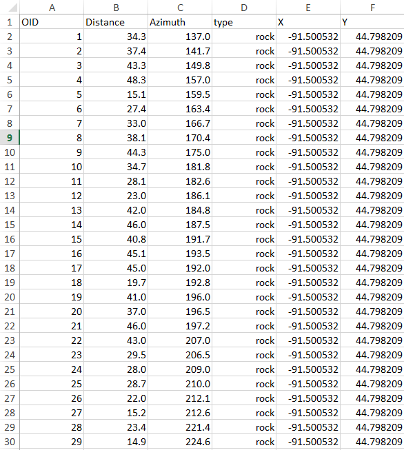
Before importing the excel table into ArcMap, I made sure the table included the following fields; object ID (OID), distance, azimuth, feature type (type), X coordinate of origin, and Y coordinate of origin. Additionally I made sure that column with numbers were set to "number" field, with the appropriate number of decimals, and that the feature type field was set to "text" because it included words.

Figure 5: A portion of our excel data table.

4) Processing the data in ArcMap:
After the table was properly organized in Excel, I imported the excel table into ArcMap. The next step was to run the Bearing Distance to Line tool on the table. This was found in ArcToolbox, under the Data Management tab within the Features toolset. In order for the tool to run the distance azimuth function properly, I needed to specify which field in my table corresponded to each drop box field in the tool window. Additionally, I selected the spatial reference to be set as the WSG 1984 coordinate system. All of the settings I chose for the Bearing Distance To Line tool are show below in figure 6.

Figure 6: Setting chosen for the Bearing Distance to Line tool.

Once I ran the tool, it projected an output image (figure 7). This image has lines leading to each object we sampled. The lines could be considered an images of our laser shots to each object.

Figure 7: Output of Bearings Distance to Line tool.
Next, in order to add a point feature class to represent our survey locations, I ran another tool called Feature Vertices to Points. Once again, this was found in ArcToolbox, under the Data Management tab within the Features toolset. Once the tool is open I was required to select where feature's vertices should be transferred to along the feature. Knowing that our features are located at the end of each Bearings line, I transfer the points to the "end" of each line, or in other words at the features last vertices. The points are displayed below in figure 8.

Figure 8: Output of Feature Vertices to Points tool with the Bearings Distance
 to Line output. The points are a separate feature class than the Bearings lines.
My final steps to symbolize the data were then taken. Due to the fact the Bearings Distance to Line Output does not retain the "type" field, I was unable to symbolize the data unless I retrieved this data attribute. I did so by running at table join, using my Feature Vertices to Points feature class as the destination table, and my original table as the source table. I joined these together by using the OID fields as the common attribute. This allowed me to designate different symbols for the trees and concrete blocks. The last element I found necessary to include was our point our origin. I was able to import this point by displaying the XY data from our original table. The final symbolized maps are displayed below. Figure 9 displays the all the data, and Figure 10 is focused on the majority of our data points, excluding the southern outlier.
 
Figure 9: Final output of our distance azimuth data, displaying all data points. 
Figure 10: Final output of out distance azimuth data, zoomed in to the majority of our data in greater detail, while excluding the southern outliner data point that is visible in figure 9.   
Metadata

Who
Ally Hillstrom and Peter Sawell
What
Collection and presentation of distance azimuth data.
When
Data was collected on September 30th, 2015.
Where
Data was collected on the campus of University of Wisconsin-Eau Claire, in the campus mall directly south of Schneider Hall.
How
Data was collected using a TruPoint Laser. This collected the distance in meters the object was located for the area we were standing. This equipment also collected the azimuth degree of the object being surveyed.

 Discussion

Before beginning our independent data collect for our lab, our class practiced using the distance azimuth survey tools. Each lab group collected a handful of distance azimuth readings, and imported them into ArcMap. From here we ran the Bearings Distance to Line tool, and Feature Vertices to Point tool to generate a point feature class. Every group in the class projected points, however none of our points were in the correct location. Our points were about another 30 degree north of where they should have been. After checking settings such as the declination setting of the tools, our professor determined that the electro magnetic force within the area we were standing was significantly altering the accuracy of the point locations. Now that I have experienced the issue first hand I would be able to recognize the issue in the further.

When review the final data output (figure 9) it is clear the point locations are not entirely accurate. For example, there are trees symbolized on the roof of a build (Davie's Center) and in the parking lot. Additionally, looking closing at the concrete blocks points, in comparison to the blocks within the picture, you can see how most are shifted to the west of their real life location. One reason this could be off is that Peter was sitting down while taking points. Perhaps standing would have allowed for a larger target, and higher accuracy data values. This discrepancy could be due to the electro magnetic field within campus, or the improper declination setting. Seeing that all points are off by a similar value, I suspect there is a problem with the declination setting of true north. We did not bring a compass out with us, which would have potentially made our points more accurate. According to the WI State Cartographer's Office, Eau Claire has a declination of 1 degree, therefore this number should have been subtracted from the north reading on our compass. Another fault in our data could have been the accuracy of our origin coordinate. Unfortunately the GPS we used was highly inaccurate, forcing us to find our location in ArcMap. Although this most likely does account of all inaccuracy of our points, it very likely may play a role.

Although the points' locations are not precisely accurate, each point is within the general area of the object they are symbolizing in the image, and the distance between each symbolized point seems to accurately portray the real life distance between objects. The accuracy of this data is somewhat relative to what it would be used for. In our class, we are solely interested in collecting implicit data, and therefore are not concern with the precise XY coordinates of a point, but rather the general location of an object. For this reason, our output shows the distance azimuth survey method should not be used to collect explicit data, but implicit data instead.

Another issue that may be attributing to the accuracy was the troubleshooting we experienced obtaining our origin coordinate. Initially, we used a Juno to collect this XY coordinate, but once we entered it into ArcMap we discovered it was farther southwest then where we were standing. Using ArcMap we found the XY location of the tree we used as our point of origin. Using this new coordinate increased the accuracy of our final projected points, but as previously stated the accuracy is still not the best.

Lastly, to confirm, the southern most outlier point (seen in figure 9) had a distance of 346 meters. Our intent was to the tree furthest away in our line of sight. The accuracy of these point's distance is somewhat unknown but looking at it's location on figure 9, the point is indeed on the farthest edge of Putnam Park.

Conclusion

Through this activity I learned reliable geographic surveys can be completed without having to rely on advanced technology. I now understand that the distance azimuth method is a great back up to have in case our original method fails, as it uses simple distance azimuth values to locate features. Although my partner and I experienced issues associated with precise accuracy, the method appears to be useful when in need of relative locations of features. This lab demonstrates the importance of learning both new and older geographic data collection techniques.

Sources

http://webhelp.esri.com/arcgisdesktop/9.3/index.cfm?TopicName=feature_vertices_to_points_(data_management)
http://support.esri.com/en/knowledgebase/GISDictionary/term/azimuth
http://www.sco.wisc.edu/mapping-topics/magnetic-declination.html


Saturday, September 26, 2015

Field Activity #2: Visualizing and Refining our Terrain

Introduction
This lab was a continuation of our previous lab that was based on the creation of a digital elevation surface. Previously, my partners and I collected elevation points of our landscapes using a grid system we designed. During this lab, we imported our excel data into ArcMap to evaluate its accuracy and to highlight areas that needed to be resampled. After running interpolation tools, our group developed a new sampling approach for our landscape. Methods and results of this resampling technique are included below in this blog.

Methods

Our first step of this week's lab was to import our original landscape data into excel. To do this, we had to verify our data was in the right format for ArcMap. We organized our data in X, Y, and Z points, where X and Y representation the grid square location, and Z represents its generalized elevation. Once the data was displayed as X and Y coordinates in excel, I exported the data. This allows the user to run tools on the newly exported feature class. To change the data from being represented as coordinates to being represented as a continuous surface, interpolation tools were run. After these images were generate, they were imported into Arcscene. This allowed us to identify areas that were not represented accurately in our model. Below in Figure 1 is our sandbox landscape. Following this are the image outputs from tools ran in ArcMap and their 3D outputs from ArcScene.

Figure 1: Our sandbox landscape 
Deterministic Interpolation Methods:

Both IDW, Spline methods, and Natural neighbor all are considered to be deterministic interpolation methods because their methods calculate the smoothness of their output surface based on neighboring values or equations.

1) IDW (Inverse distance weighted) Interpolation:

This  method of interpolation estimates cell values by obtaining the average of all data points within a close proximity of each cell. The closer cells to the point being measured have higher influence in the average being calculated, which is bases on an assumed relationships that data points located closer together are more alike than points farter apart. This interpolation model represents our hill, ridge, plain, and depression well however did not accurately model the ridge.


Figure 2: The left image is the IDW output from ArcMap, and the image on the right was created by bringing the left output into Arcscene.

2) Spline Interpolation:

The spline interpolation estimates values using a mathematical function to reduce the curvature of the surface. The end result of the interpolation is a smooth surface, in which passes through all data points. Once again, the interpolation model represents our hill, ridge, plain, and depression well however did not accurately model the ridge. The spline model is smoother than the IDW model, however the valley is not as defined as Natural Neighbor.


Figure 3: The left image is the Spline output from ArcMap, and the image on the right was created by bringing the left output into Arcscene.

3) Natural Neighbor Interpolation:

This interpolation method locates the closest data points to a point of interest, and applies weights to the closest points based on the proportion of the area to calculate an output value. This is known to not interfere with data variation such as peaks, ridges, and valley such as in our landscape, and is known to work well with data that is distributed either normally or irregularly. Our hill, ridge, plain, and depression are represented well however the valley is still not completely accurate once again.


Figure 4: The left image is the Natural Neighbor output from ArcMap, and the image on the right was created by bringing the left output into Arcscene.

Geostatistical Interpolation Methods:
The Kriging method is considered to be geostatistical interpolation methods because it uses statistical methods to find relationships between the data points. Using geostatistical methods, a user can create a prediction surface can also receive a measure of how accurate the predicted surface is.

4) Kriging Interpolation:

The model is used to explain the spatial variation in a surface by analyzing the distance between data points. The kriging model uses a math function to fits all points within a specific location which then develops an output value for each location. This interpolation model represents our hill, ridge, plain, and depression however did not represent the valley at all. Kriging failed to indicate any existance of this feature.


Figure 5: The left image is the Kriging output from ArcMap, and the image on the right was created by bringing the left output into Arcscene.

TIN (Triangular Irregular Networks)

TIN's are a type of vector based digital geographic data that are used to represent surfaces. These triangulate a set of data points to form triangles throughout the surface, which forms a continuous surface of none overlapping triangles. This methods is know to work to model terrains, however, within this output it is apparent our hill, ridge, plain, are represented well but now the valley.

Figure 6: The left image is the TIN output from ArcMap, and the image on the right was created by bringing the left output into Arcscene.

Resampling Methods:

Once we compared these output, we determined all our landscape features were accurately represented in our model except for the winding valley. After discussing, our group decided that resampling using a stratified sampling concentrated on the portion of the sandbox that contains a valley would give us more precise elevation data. We knew that reducing the size of the grid squares to increase the grid’s resolution within our new sampled section would increase the accuracy of the DEM as well.

To begin designing our new measuring grid, we decided the grid squares within Y coordinates 9 through 15 and X coordinates 1 through 14 would be changed from the original 8cm x 8cm dimension to 4cm x 4cm. The box was laid down and leveled in the same location as the previous lab. We used the same origin 2b as the previous lab, and from here we measured out 4cm x 4cm boxes. We created a grid using push pins and string only in the area previously specified. Now, we could begin data collection.

We measured each grid squares elevation using the same methods as the first lab. Due to the fact the box was initially leveled using a leveler at each corner the tight string represented a flat zero level. All elevations sampled were below the sting and therefore received a negative number. Each grid squares value was measured at the top right corner. This data was then entered into an excel spreadsheet. During this we collected a total of 392 new points.

Figure 7: Our resampling grid. New data points were only collectedin the portion of the sandbox where the valley is located. 
Figure 8: Casey gathering elevation samples. 
Our next step was to import the new data into excel to run the interpolation tools in Arctoolbox. Once this step was complete, these outputs were then brought into ArcScene. Here, the base height was changed to float and the extent was increased for each output. After comparing, I decided the Natural Neighbor tool best displayed our resampled data.

Figure 9: The left image is the Natural Neighbor output from ArcMap, and the image on the right was created by bringing the left output into Arcscene. The image are generated by using our resampled data, collected for lab 2. This model represents our hill, ridge, plain, depression, and the valley well. I chose this model amongst the other tool outputs because it smoothed areas that need smoothing out without leaving out minor changes in elevation, such as the small ridge running vertically along the left side of the right image.

Metadata:

Who
Ally Hillstrom, Casey Aumann, and Morgan Freeburg
What
Data Collection of sandbox landscape to create a Digital Elevation Model
When
Lab 1 data collected September 18th, 2015
Lab 2 data collected September 22nd, 2015
Where
UWEC Campus at the flood plain of Chippewa River in Eau Claire, Wisconsin
How
Data collected using a square grid to sample an area of 122cm x 114cm within a wooden box. Elevation points were taken within each grid square with a measure stick.

Discussion

At the beginning of this lab we analyzing our data from the first lab. Five tools (IDW, Spline, Natural Neighbor, Kriging, and TIN) were run in ArcMap, and later imported into ArcScene to determine how accurately they depicted our landscape. All five tools had problems portraying the half of our sandbox that included the winding valley. Each tool can pros and cons of generating our models in comparison to each other.

With our initial data, the least accurate model was the Kriging output. It seemed to generalize the data too much and overly simplified all features. The hills elevation intensity was reduced, and the valley was not present. The TIN model was similar to the Kriging in that our landscape was heavily distorted. At this sample density the TIN inheritantly could not portray smooth surfaces on hills or the valley, and therefore is not a good choice for our DEM. It seems we would have to significantly increase the sample point density to reduce the intensity of the unnatural peaks created within by the TIN.

The IDW model represented most features, however the model created unrealistic peaks and bulges within each grid square. For example, the plain terrain is bumpy, as well as the surface of the hills, which is inaccurate. For this reason, it does not represent our landscape well. Additionally, the elevation of data points in this model are influenced by the elevation of nearby points, which may have lead the model to incorrectly assume elevation points if the neighboring value in reality were not similar.

The Spline method represented the landscape well. It is more detailed than the Kriging model and is smoother than the IDW model. The accuracy of the model is most likely based on the fact the model fits each data point to its output. On the other hand, the elevation changes throughout the output are not as defined as well as they are within the natural neighbor method. The Spline model presents the landscape in a fluid way, however it appears too fluffy.

After comparing all five outputs, our initial landscape's features were most similar to the features in the Natural Neighbor model. Although this model uses neighbor data points to estimate nearby data points, similar to IDW, this model also take the data points proportion of area into consideration. The amount of area the point covers dictate the weight of the point. This interpolation function seems to define our features the more. For example, the areas where the plain meets the valley are more sharply and accurately displayed in comparison to the smooth slopes and edges as the IDW and Spine model. 

Attempting to increase the accuracy of our DEM, we resampled our landscape. We chose to reduce the size of the grid squares in the half of our sandbox that contained our valley, to increase the resolution and increase the density of sample elevation points within this area. After collecting our 392 resampled points, we imported the table in to Arcmaps and reran the four interpolation tools. Once these outputs were brought into Arcscene, I determined that Natural Neighbor tool once again best portrayed our landscape's features. This resampling method increased the accuracy of our valley tremendously however it is still not free of error.

Referring to Figure 9, within the valley there is a small stretch of area with a higher elevation than our real life landscape. To attempt to fix this problem, we could have retake sample points of this small area to make sure no data collection errors exist. Otherwise, we could resample the landscapre again by reducing the size of the grid squares dimension further to find even more accurate elevations. Overall, I feel the Natural Neighbor best represents our resampled landscape in comparison to the other tool outputs because it smoothed areas that need smoothing out without leaving out minor, however existing, changes in elevation such as the small ridge running vertically along the left side of the right image (figure 9).

Conclusion

While working on this lab for the past two weeks, I was exposed to new ways to collect geospatial data. My team and I developed a two unique coordinate system grids to collect elevation data of a sandbox landscape. We accomplished our goal of creating a digital elevation method of our landscape by importing our data into both ArcMaps and ArcScene. Throughout the lab I practiced running interpolation tools on our image outputs, while learning how they work and how to interpret them. This week, we were required to think critically to develop a resampling method that would increase the accuracy of our original DEM. This project required a lot of time, patience, team work, flexibility, and troubleshooting. Now that I have practiced gathering geospatial data, importing it into ArcMap, a running Arctools to generate DEM outputs, I feel confident that I would be able to repeat these tasks in future projects, either during another class project or on my own.

Sources

http://help.arcgis.com/en/arcgisdesktop/10.0/help/index.html#/How_Spline_works/009z00000078000000/
http://help.arcgis.com/en/arcgisdesktop/10.0/help/index.html#/How_Natural_Neighbor_works/009z00000077000000/
http://help.arcgis.com/en/arcgisdesktop/10.0/help/index.html#/How_Kriging_works/009z00000076000000/
http://help.arcgis.com/en/arcgisdesktop/10.0/help/index.html#/How_IDW_works/009z00000075000000/
http://help.arcgis.com/en/arcgisdesktop/10.0/help/index.html#//006000000001000000.htm


Saturday, September 19, 2015

Field Activity #1: Creation of a Digital Elevation Surface

Introduction:
For our first lab assignment we were instructed to create a Digital Elevation Model of features within a sandbox model. We were given minimal guidance on how to complete the task, which required us to think critically to develop our own methods and solve problems as they arose. Our methods involved sculpting features in our sandbox, followed by creating a coordinate system. This allowed us to collect elevation data and associate it with a precise X and Y location within our study area. With this data we will be able to replicate the landscape features as a 3D model.

Methods:
On September 18, 2015, my two partners and I gathered our supplies and headed to our study area located in the flood plain of the Chippewa River, within the campus of the University of Wisconsin-Eau Claire. At 1:30pm, we chose a location under the walking bridge that had a sufficient amount of moldable sand. As we set up our 122cm x 114cm box, we attempted to level out the sand beneath it to the best of our ability by using a leveler at each side length and corner of the box. Following this step, we constructed a ridge, valley, hill, plain, and a depression in the sand within the box.

Molding our landscape
 
Our landscape that includes a ridge, valley, hill, plain, and a depression.
 
 
Knowing that the inside space of our previously constructed box had the dimensions of 122cm x 114cm, we decided to make a string grid of boxes with the dimensions of 8cm x 8cm. Using a measure stick to measure our columns and row, and pushpins to hold our string grid in place, we designed a coordinate system that contained 15 squares x 14 squares.


Our coordinate system grid, made by using string and pushpins.

Next, we labeled one side X and the other Y. Each column and row was then labeled with continuous number scale to create our coordinate system. The X variable had values ranging from 1-14, and the Y variable had a values ranging from 1-15. In this case, the x, y values recorded in the table represent a location in the grid. Once we had the coordinate system labelled on the box, we collected the distance value from the surface of the sand to the string above in the top right corner of each grid square. We considered the sting’s level to be at level 0, similar to sea level, where an elevation recorded beneath the string receives a negative value, and any elevation above the string would receive a positive value. In our model, all of our elevations were below the string, and therefore had negative values.

Casey measuring the Z value on an individual grid square.

Collecting X, Y, and Z values while entering them in the computer.
A portion of our data table, including X, Y, and Z values.

Discussion:
In general, the project went well. We successfully constructed our own coordinate system for our sandbox model, and gathered over 210 data points. Although we did complete the assigned lab, the methods took longer than expected due to a few unexpected issues. These issues required us to think critically and work together to develop solutions in a timely matter.

As previously stated, leveling the box was more difficult than we assumed it would be. We used the resources we had to make our best attempt, however it is difficult to say how accurately the box was initially leveled.

Another problem we ran into was deciding the dimensions of our grid boxes. We realized our box’s side lengths were not perfectly divisible by practical grid square dimensions, which required us to have one column and one row of grid squares with the remaining smaller side lengths. To overcome the issue, we made the decision to not collect data points within these smaller squares in order to keep our coordinate system grid as accurate and consistent as possible.

While collecting our Z values for elevation, we became aware of an issue dealing with data accuracy. To keep the measurement collection consistent and unbiased, every Z value was collected at the top right corner of each grid square. Due to this, the surface elevation measured within that corner was recorded as the elevation of that entire square. Although 8cm x 8cm squares did not seem oversized, they were large enough to contain a surface with varying elevations. Here I saw firsthand how using this method to collect Z values generalizes the squares surface information, which I imagine can lead to potential data accuracy errors. Using smaller grid squares in the coordinate system could possibility alleviate the issue, however would require more time and resources.  

Lastly, we experienced the unpredictability of fieldwork due to weather conditions. We had to postpone our meeting time to later in the week due to heavy rain, which required all group members to be flexible.

Conclusions:
By creating our own digital elevation model, we were required to create our own methods of surveying our study area. This required us to think critically and geospatially to determine the best fit methods. Our group successfully designed a way to collect elevation data within our sandbox model using our unique coordinate system. This lab required team work, creativity, geospatial thinking, flexibility, and patience. Overall, our group is happy with the outcome of our project and expects to generate a 3D model of our data in a future lab using ArcMaps.